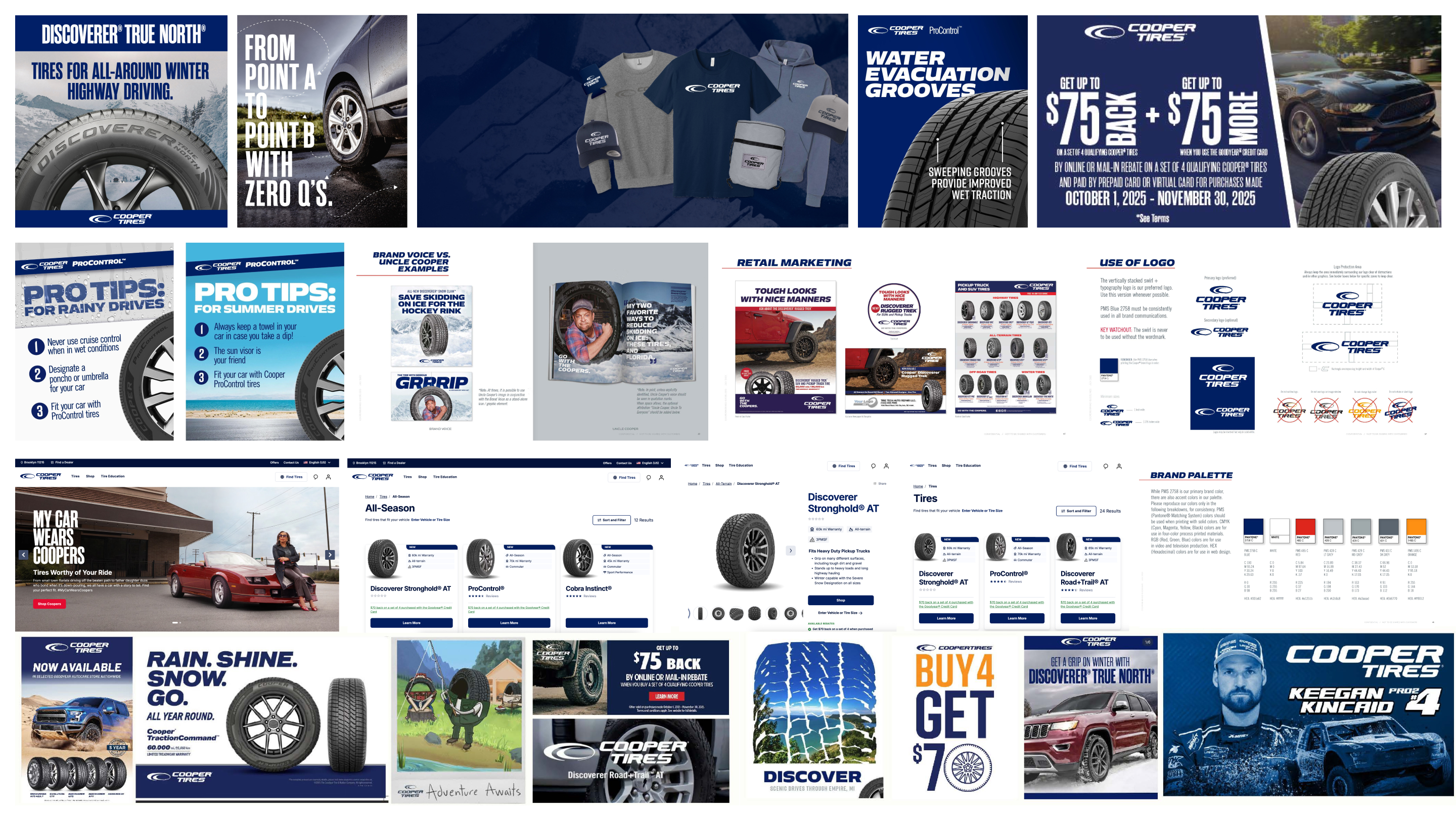
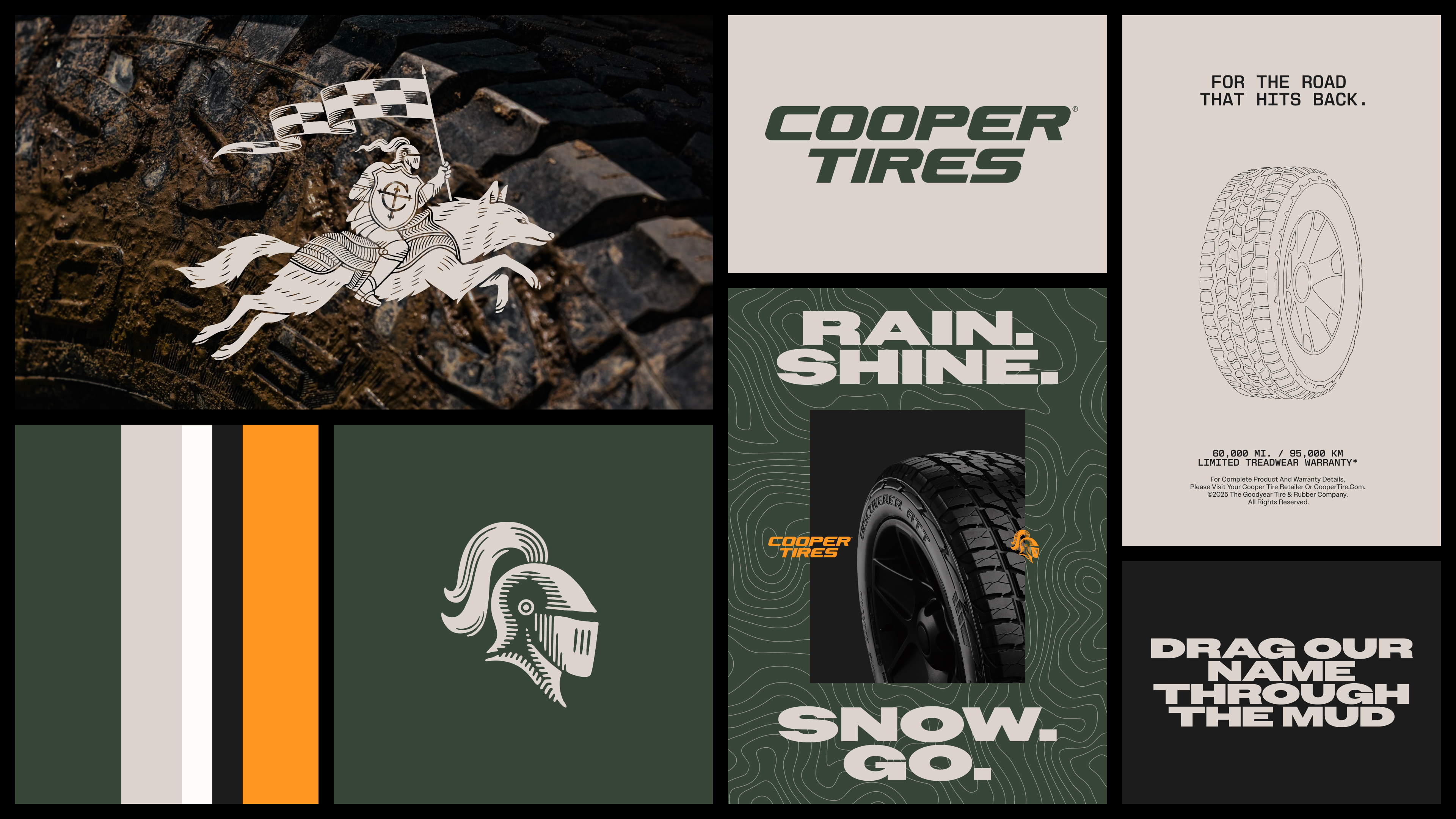
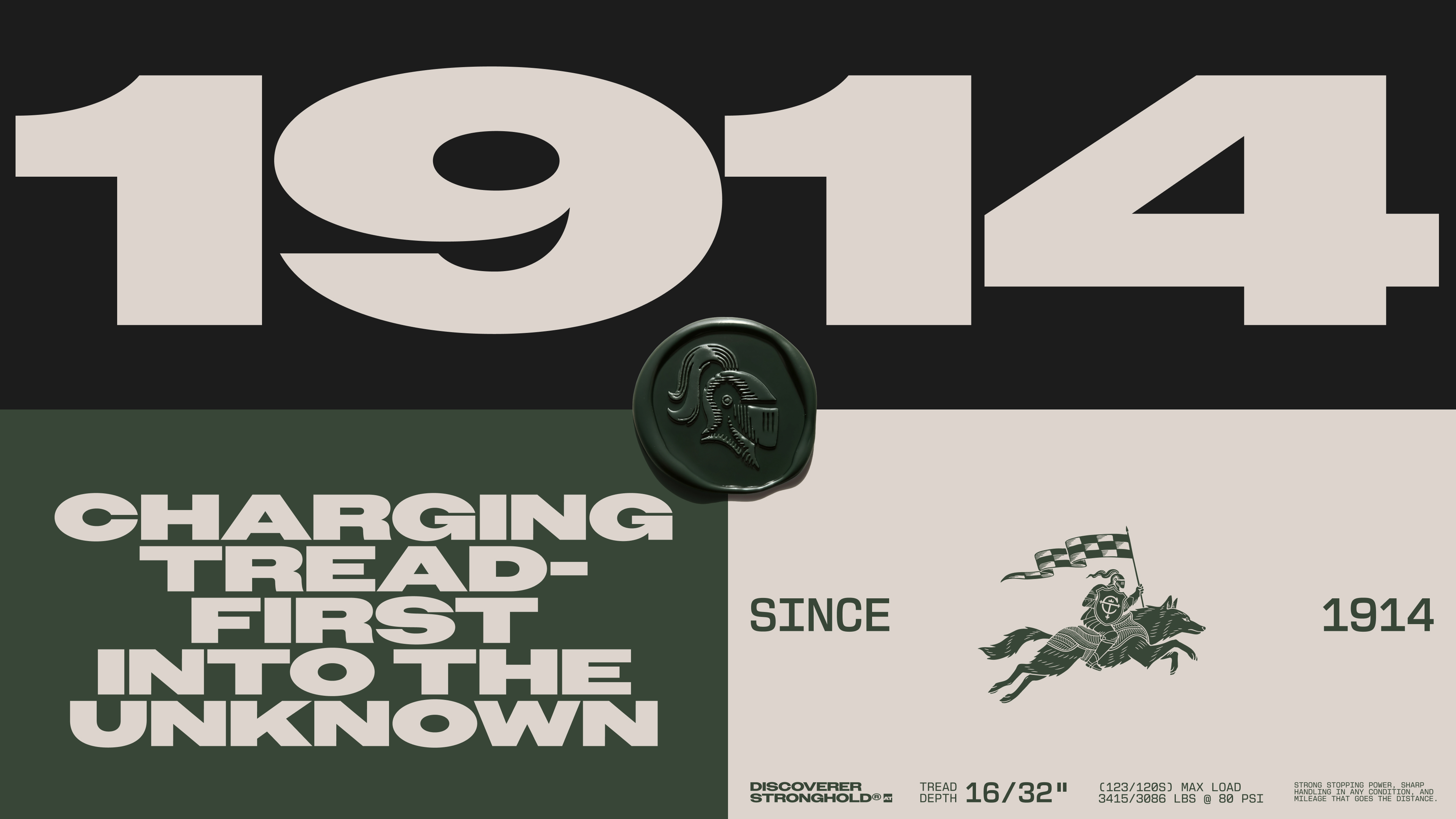

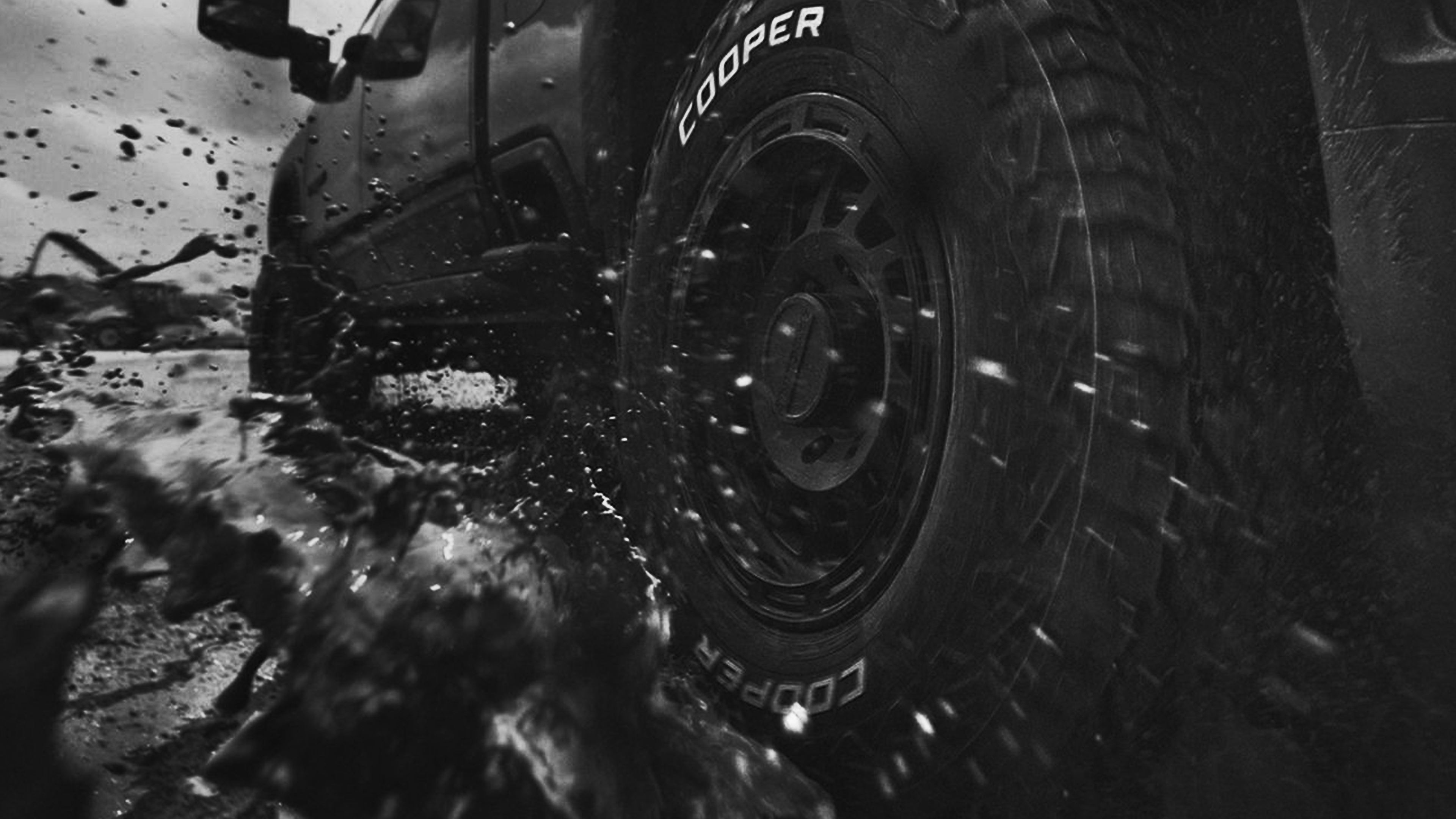

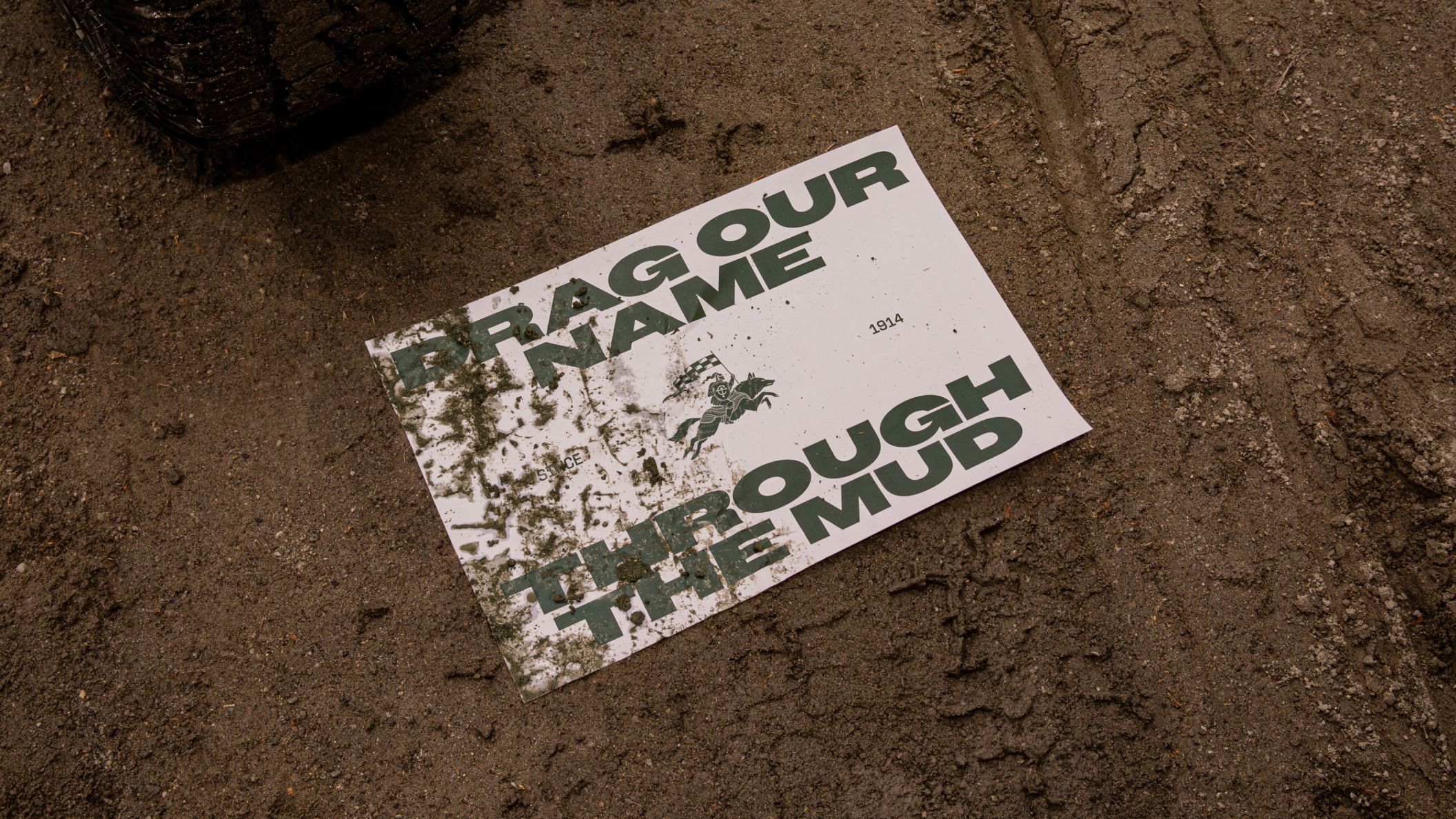
Cooper has spent more than a century perfecting the toughest tire around. The product was exceptional. But the brand no longer reflected it. The challenge was standing out in a crowded global market where the brand had started to blend in.
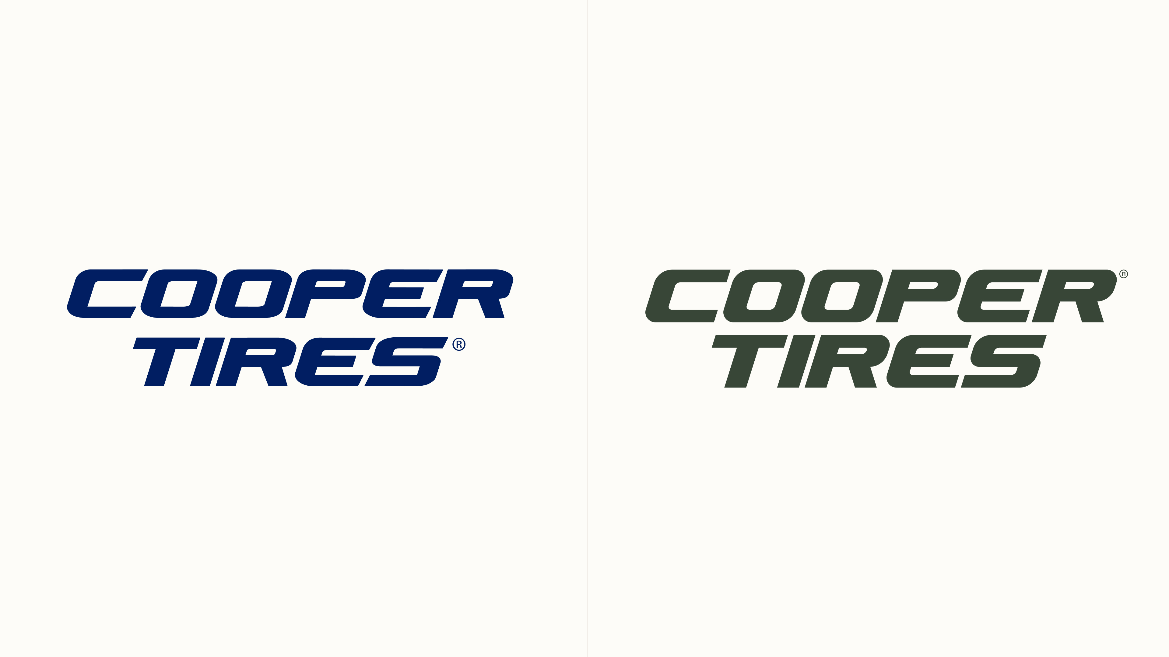
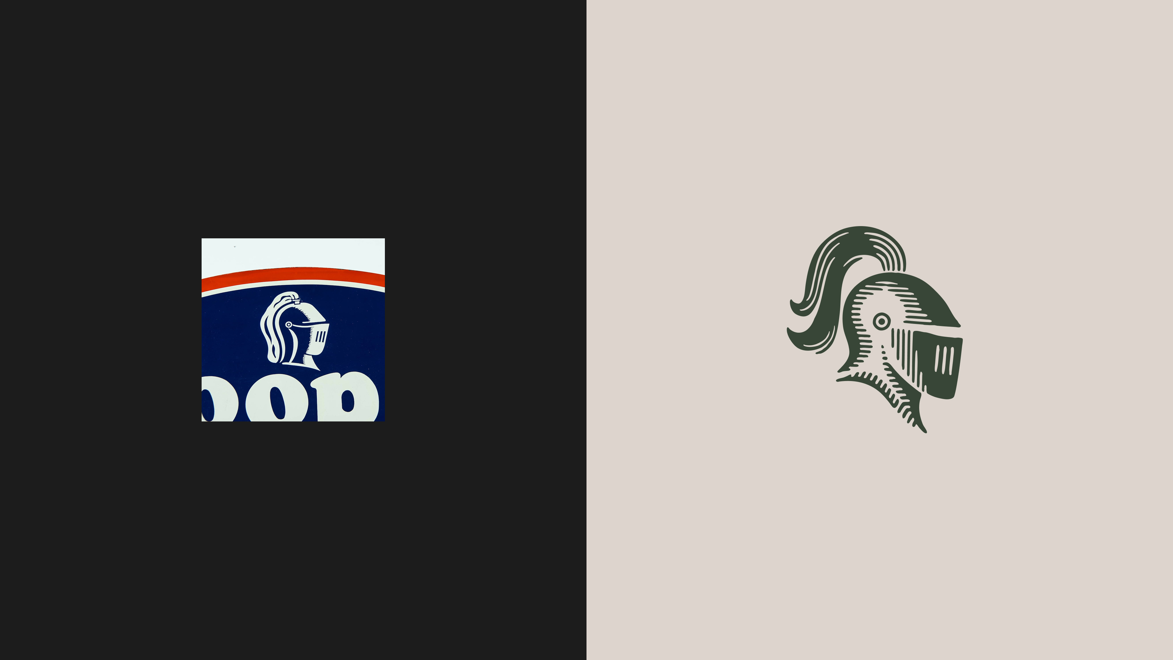
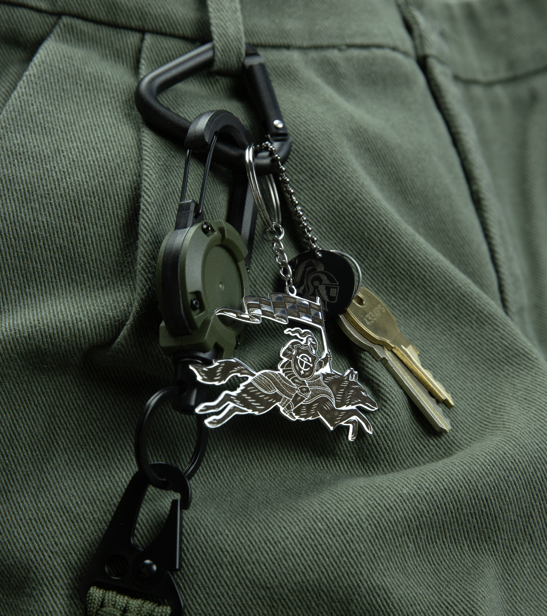
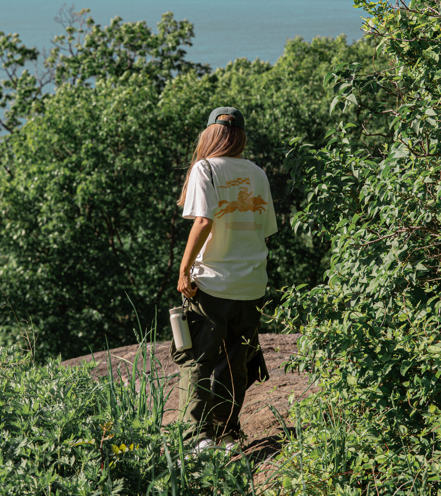
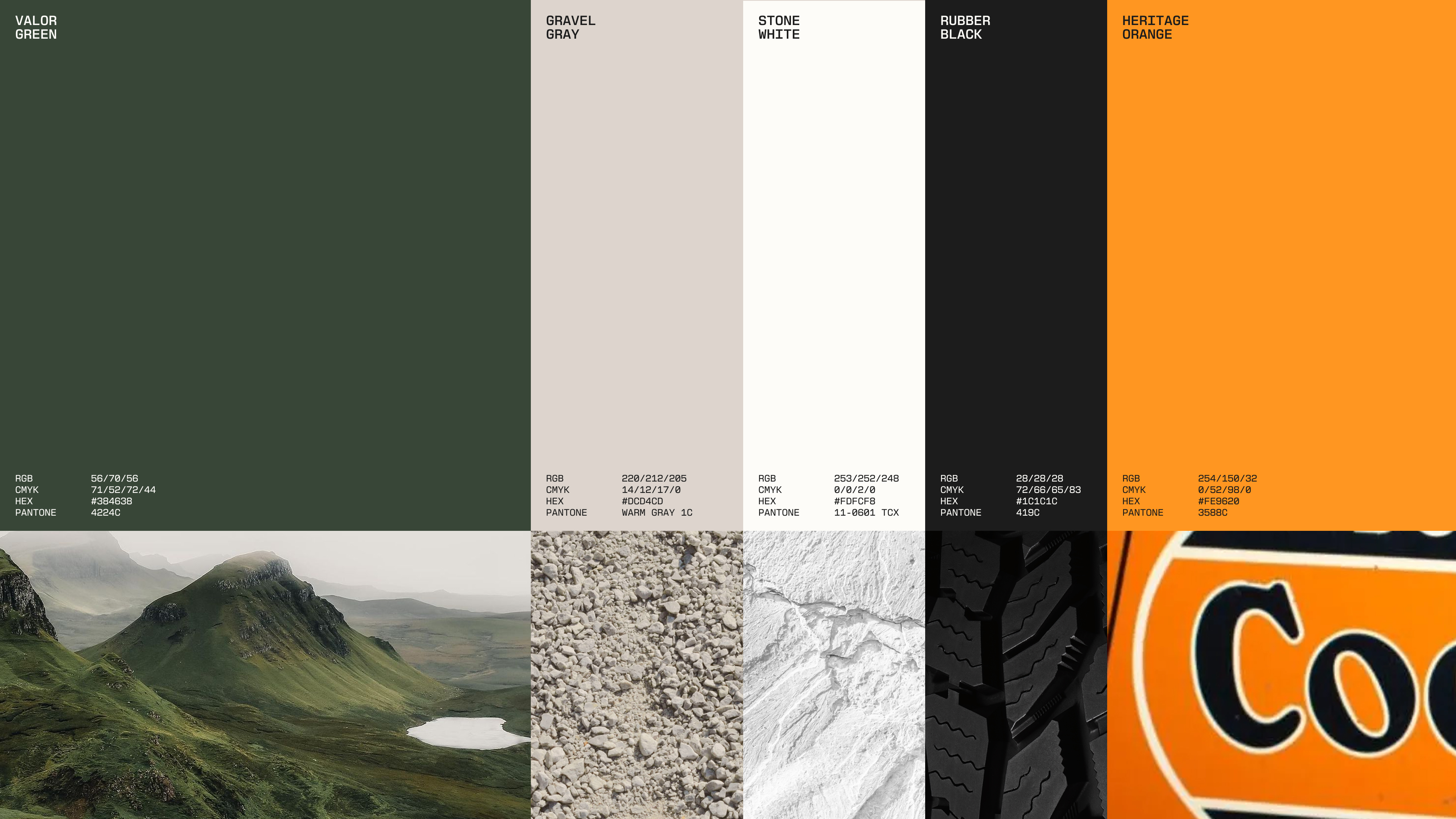
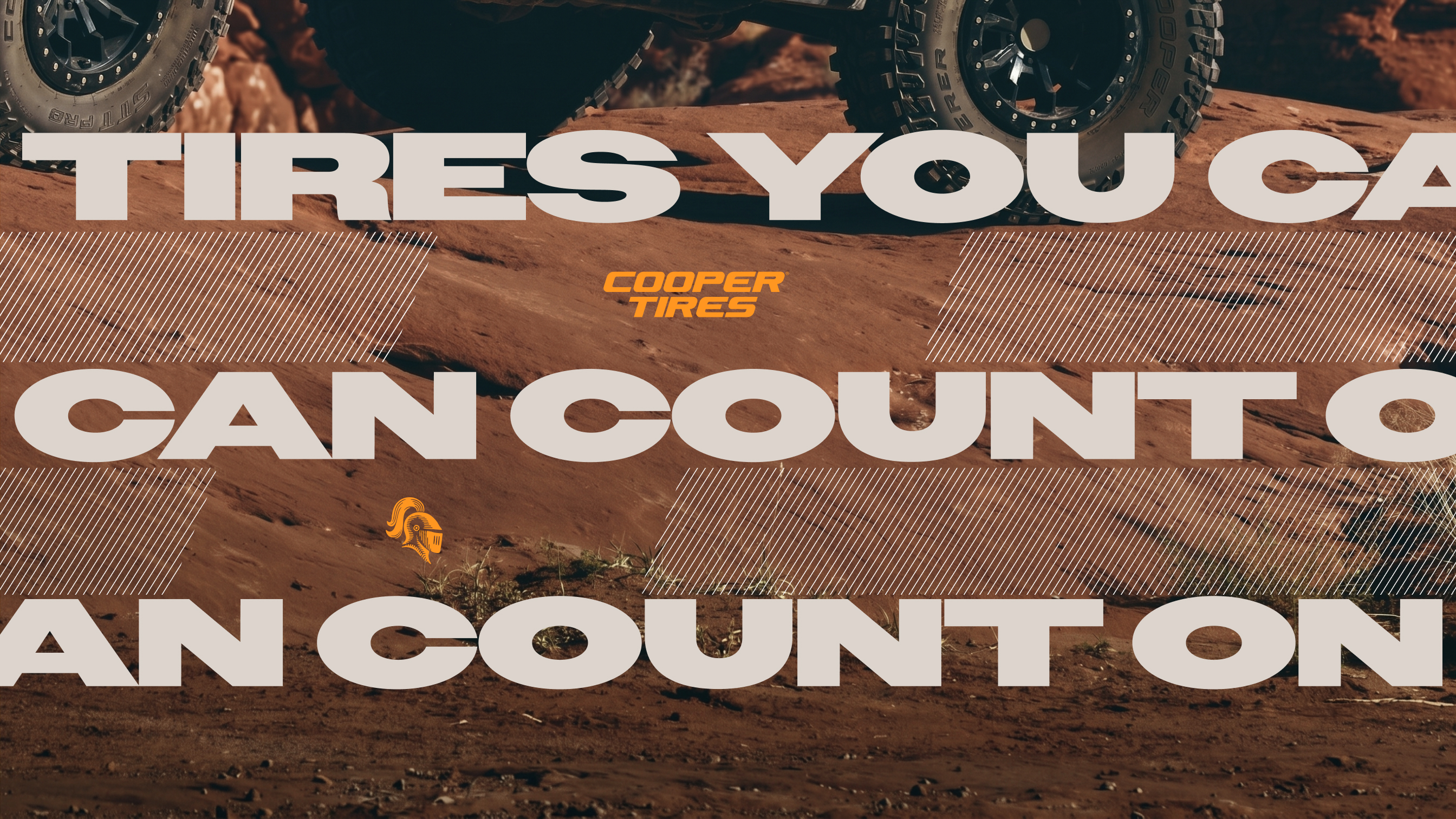
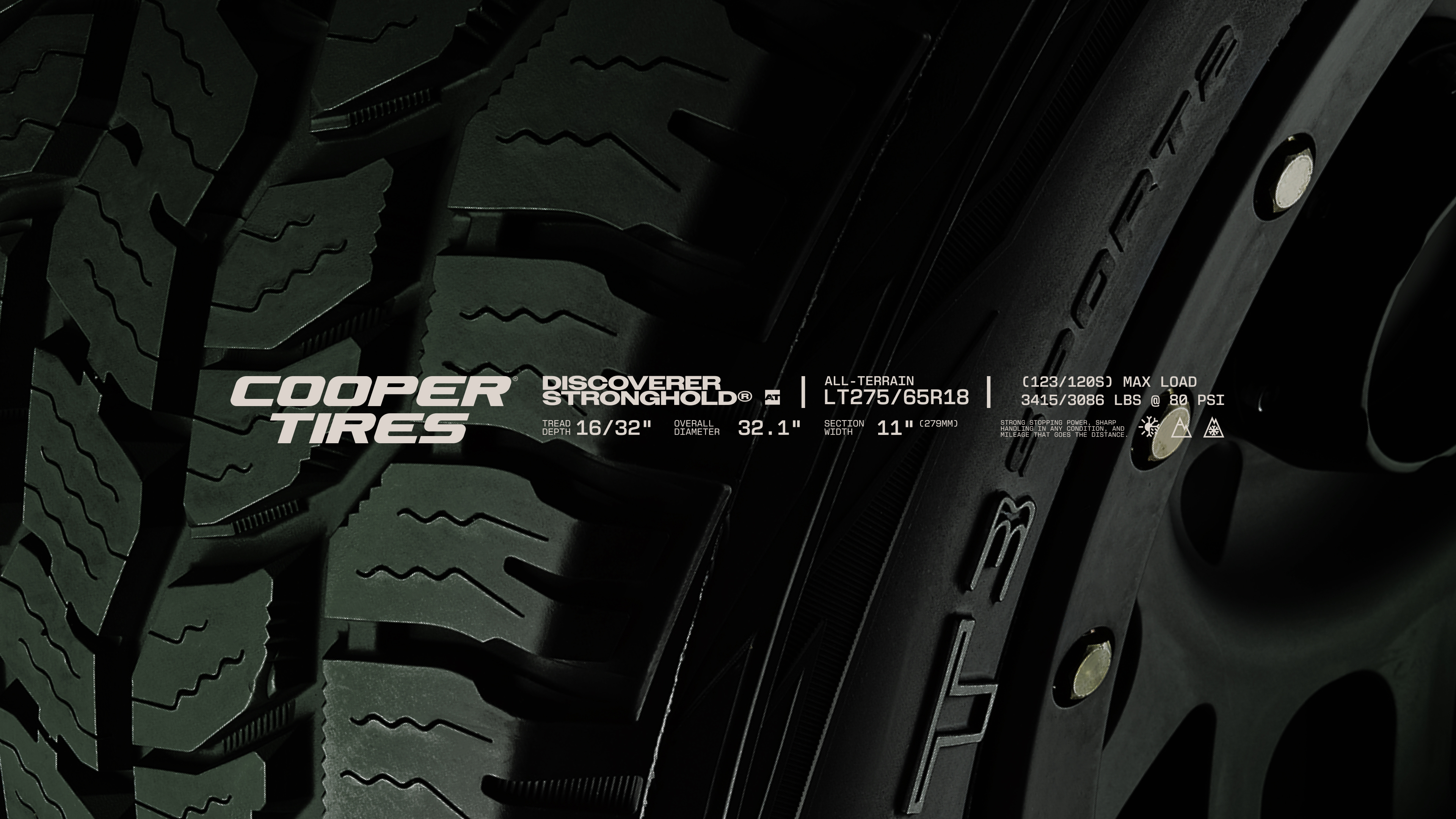
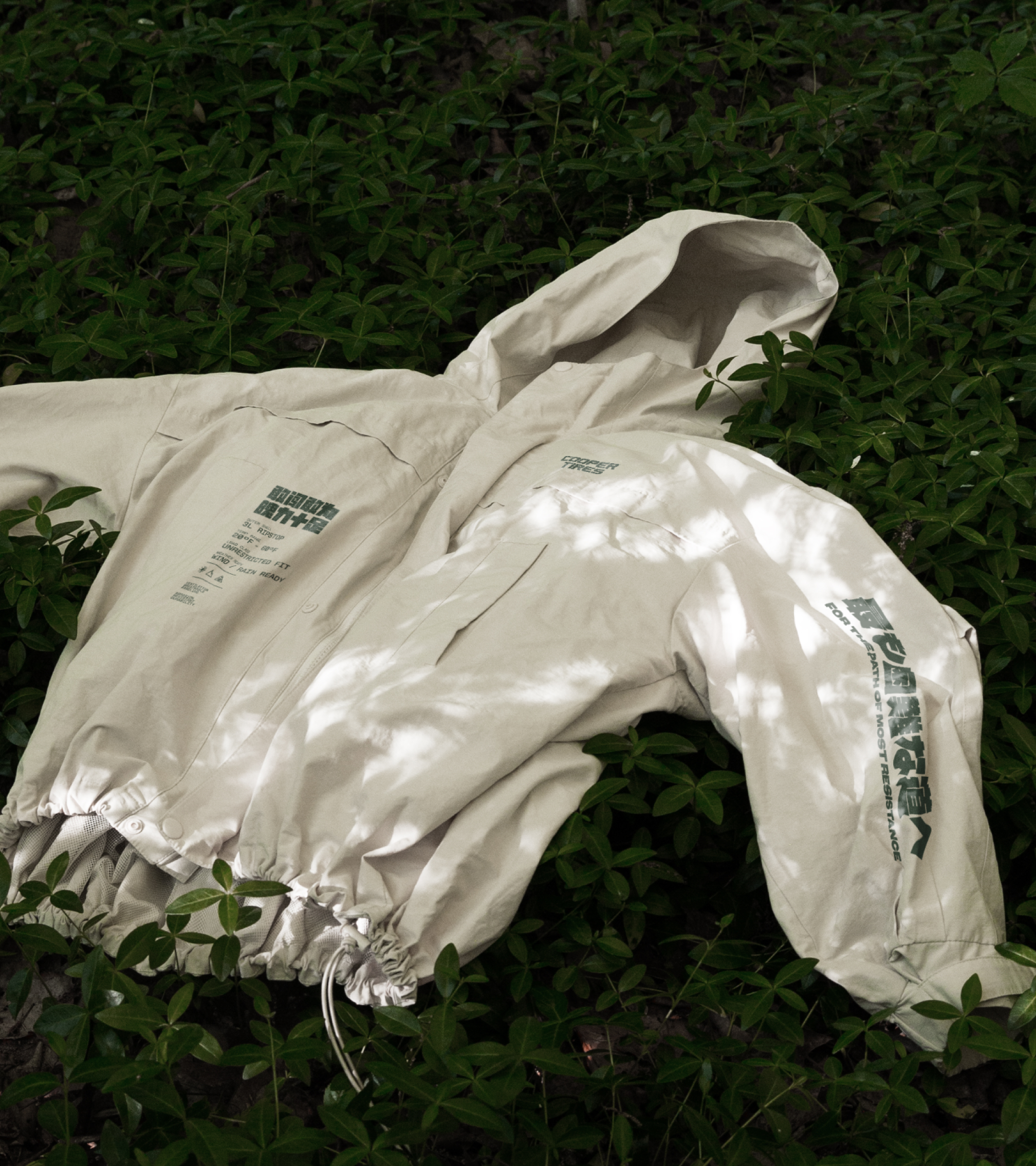
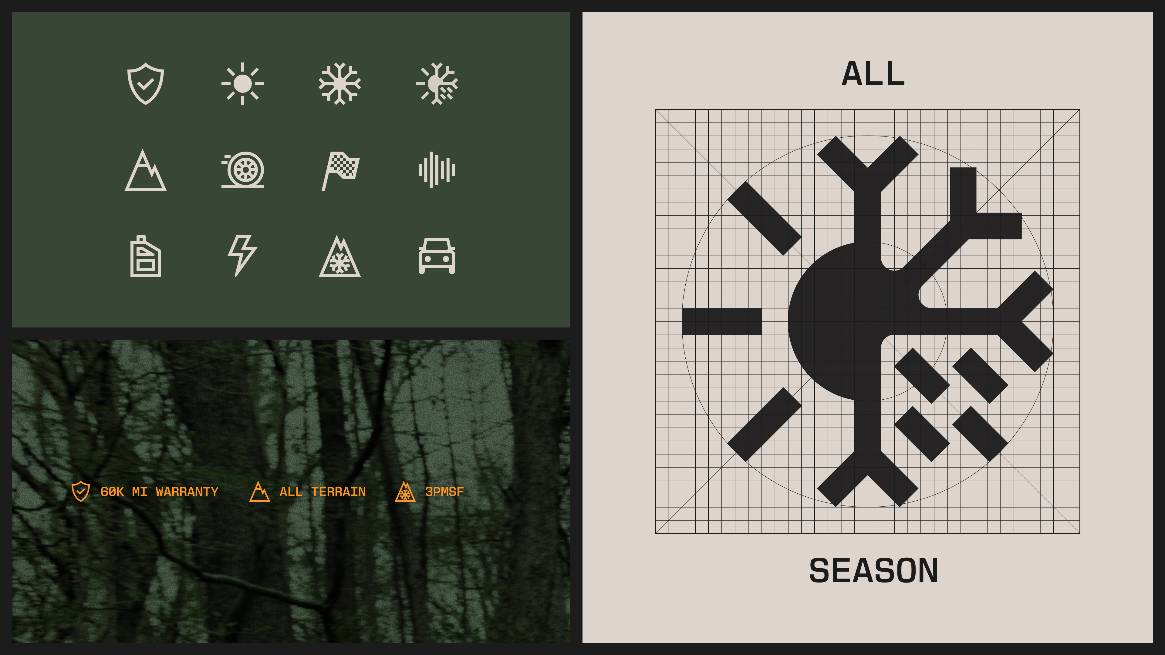
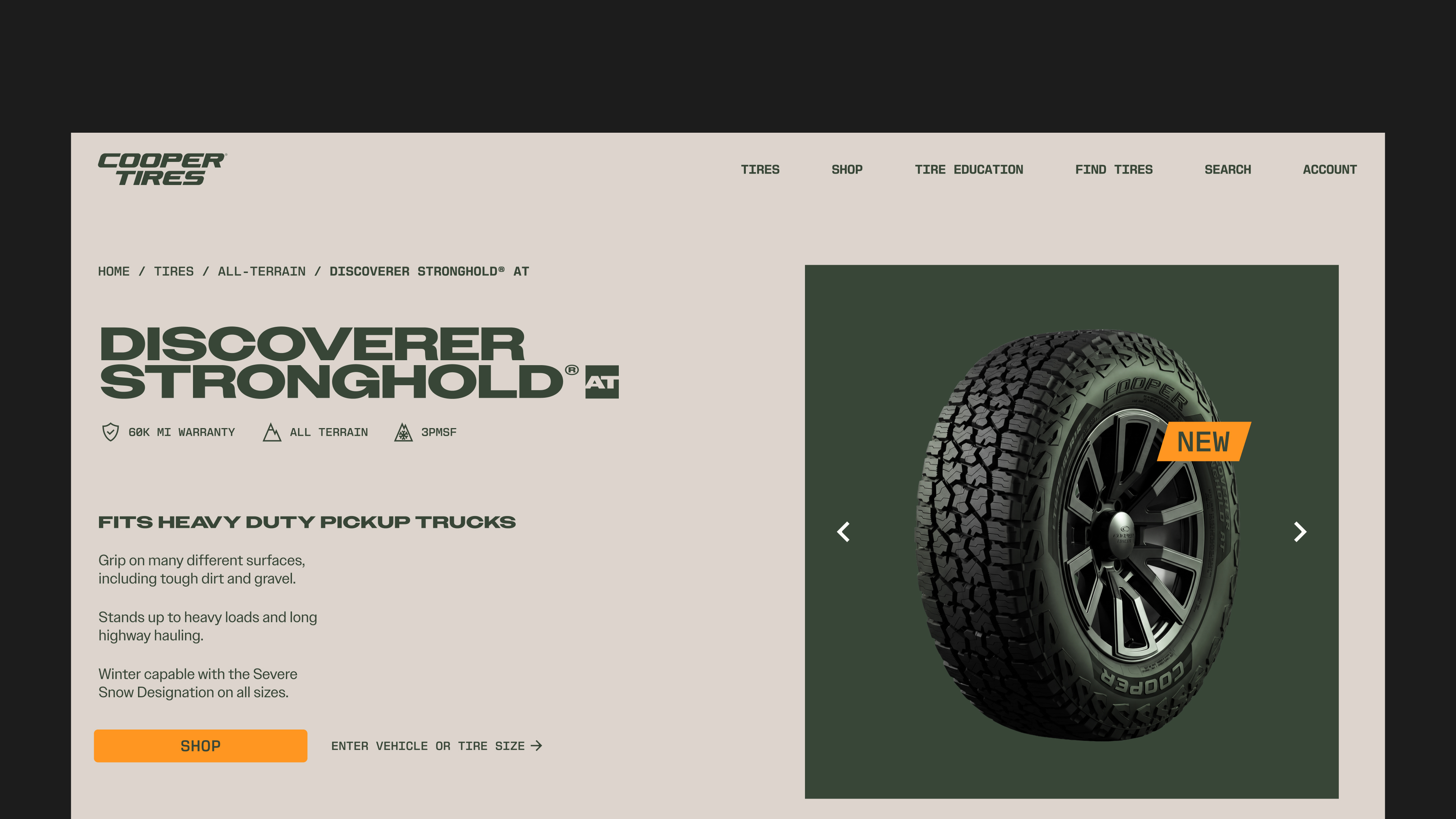
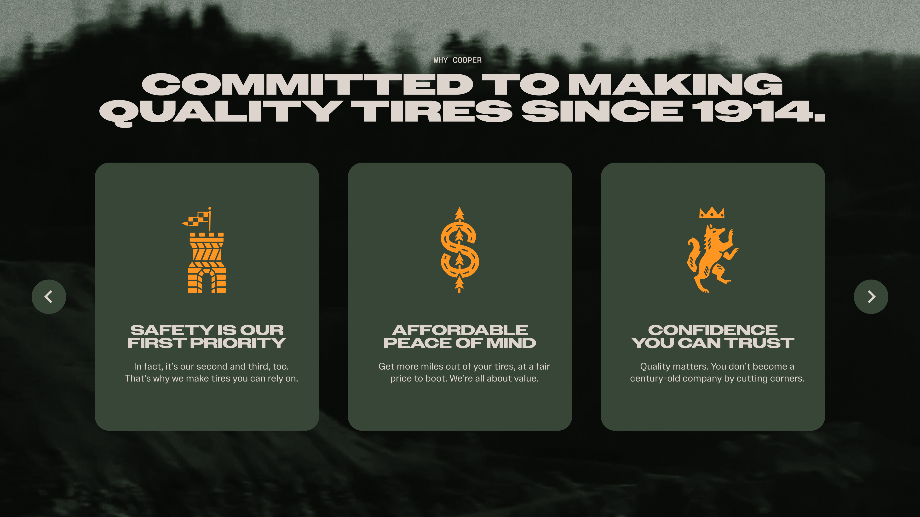
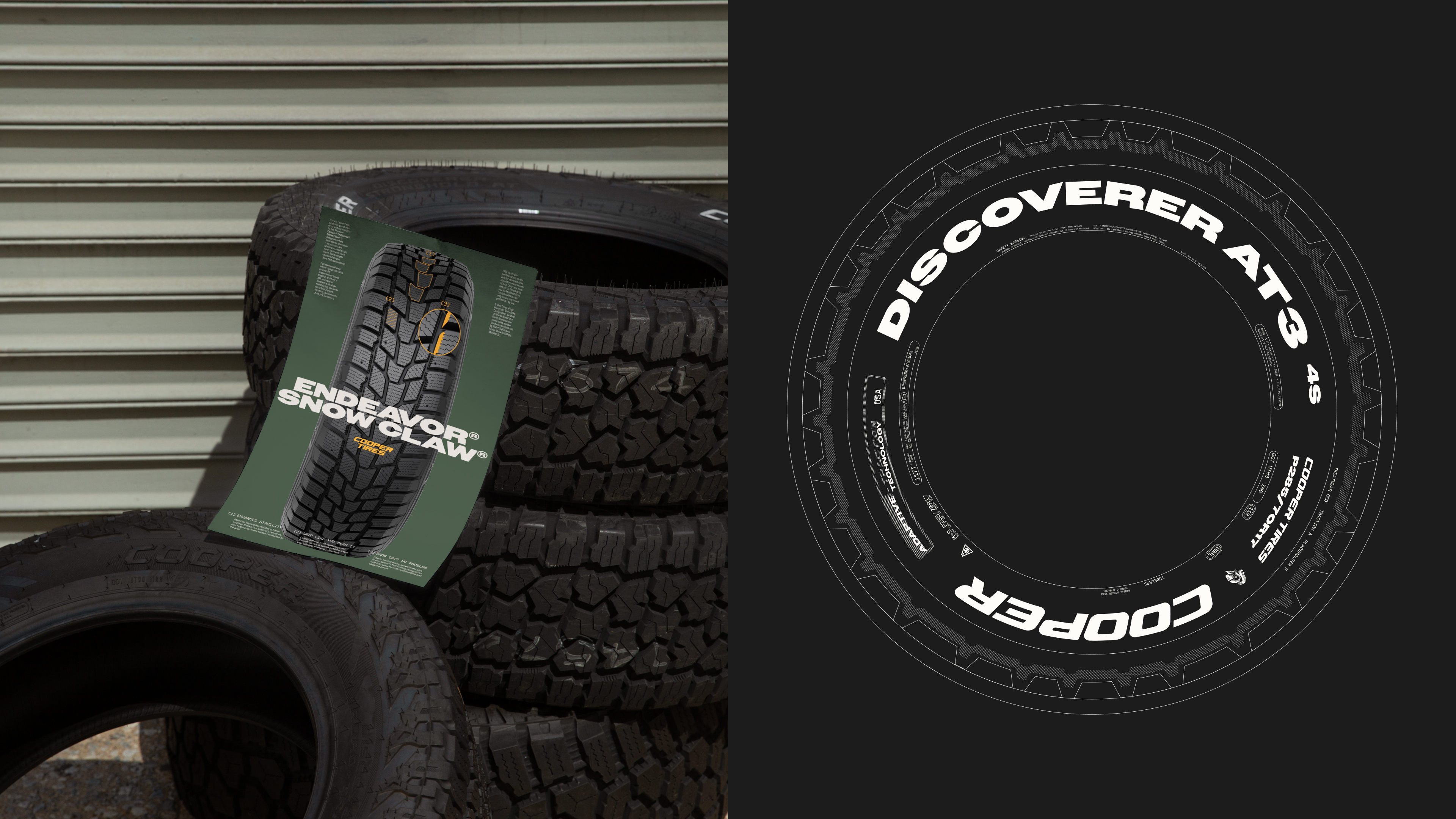
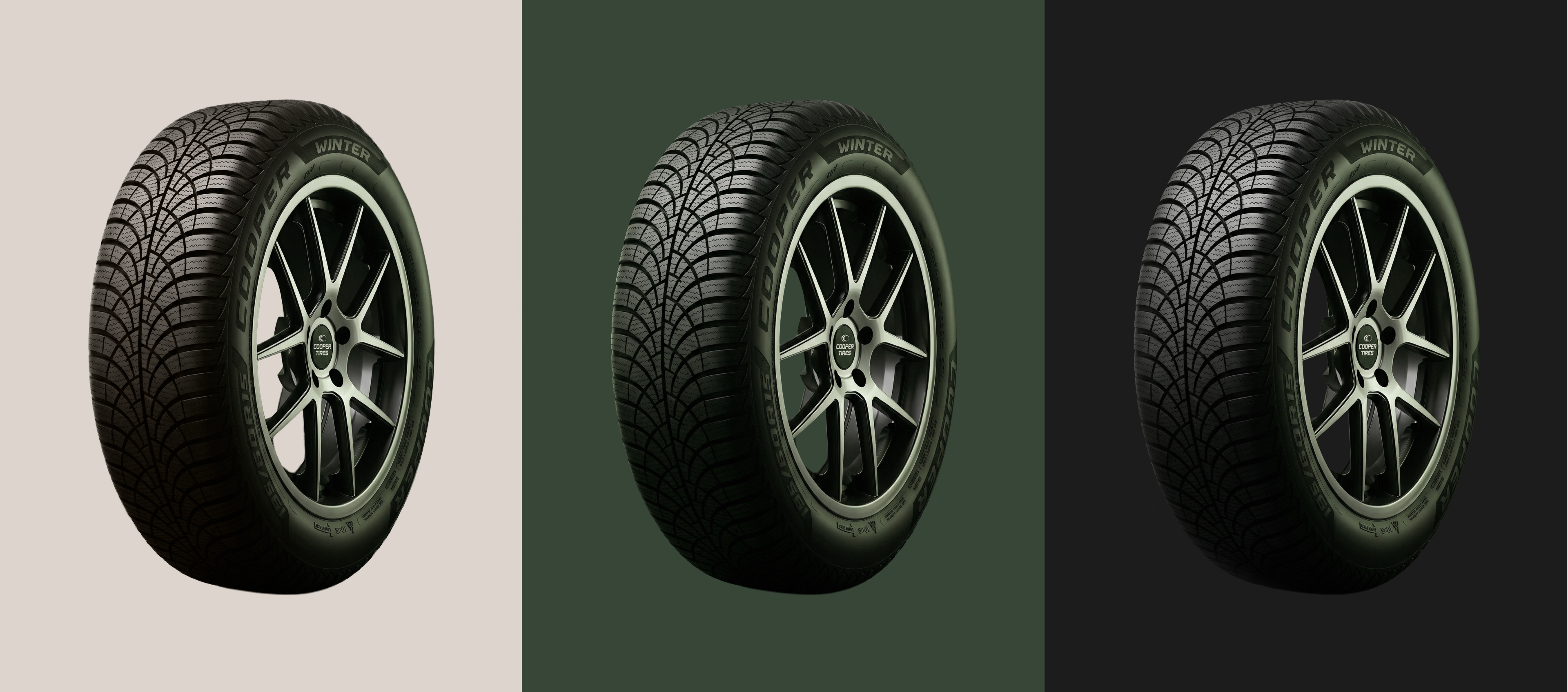
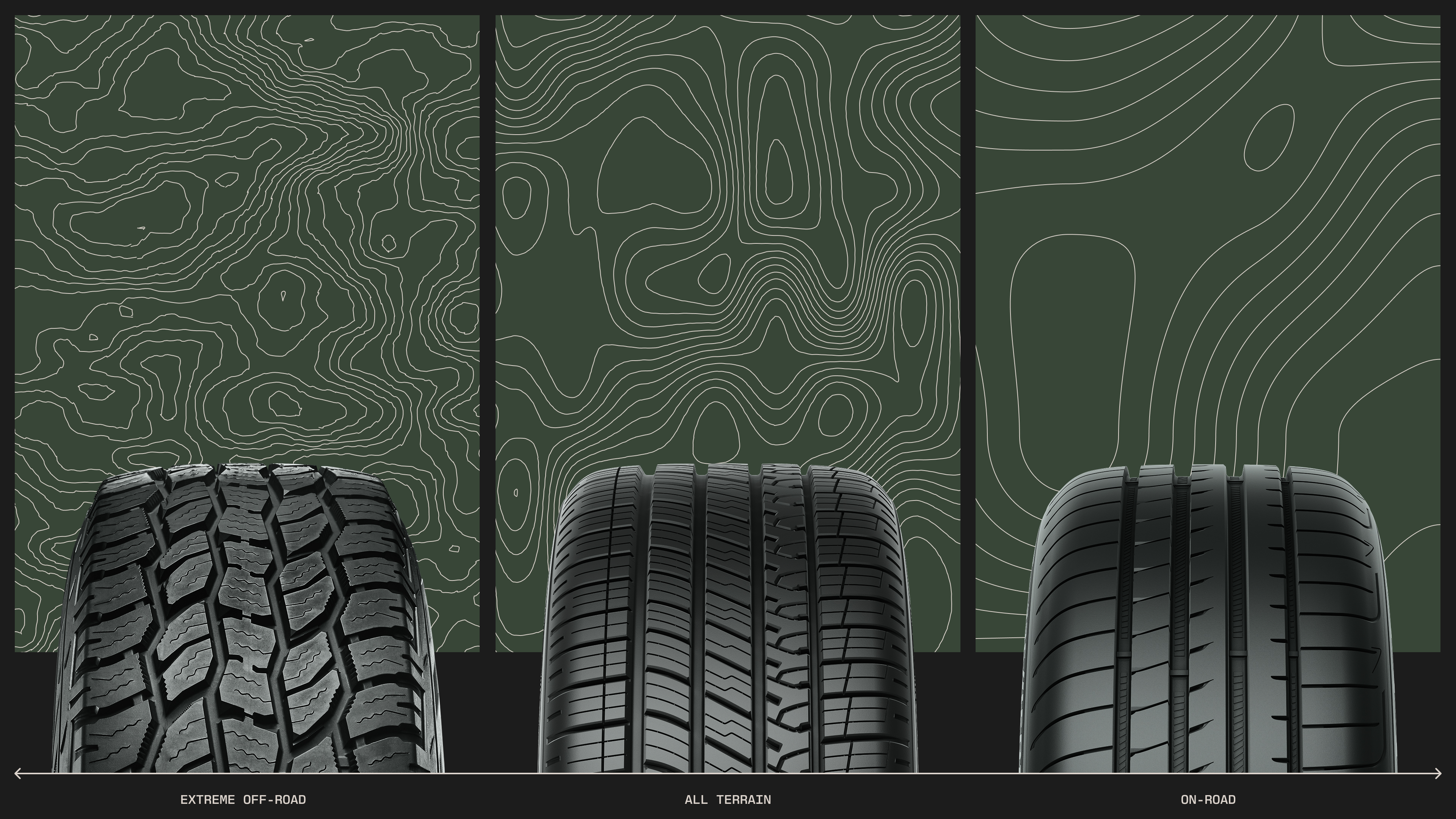
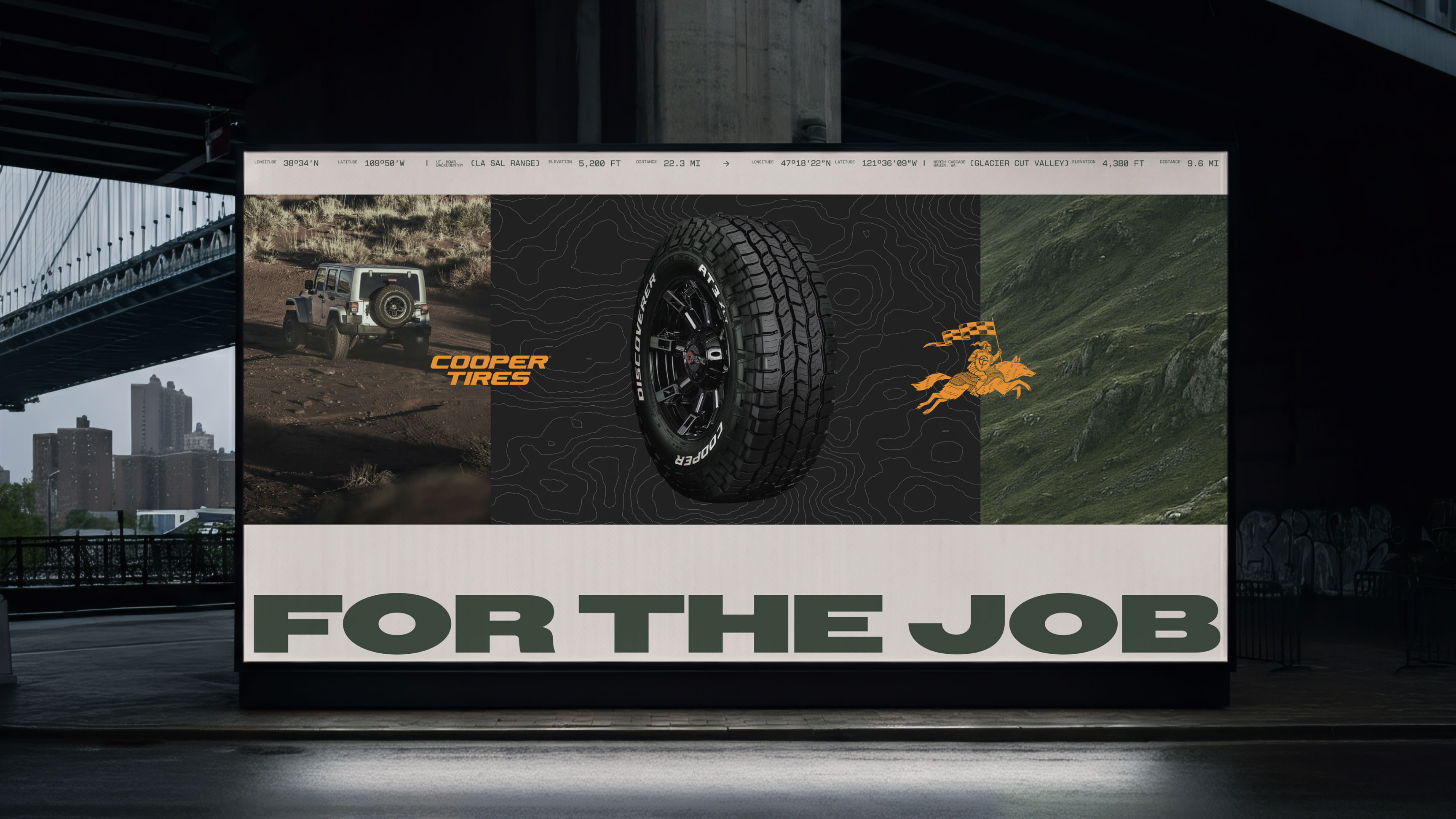
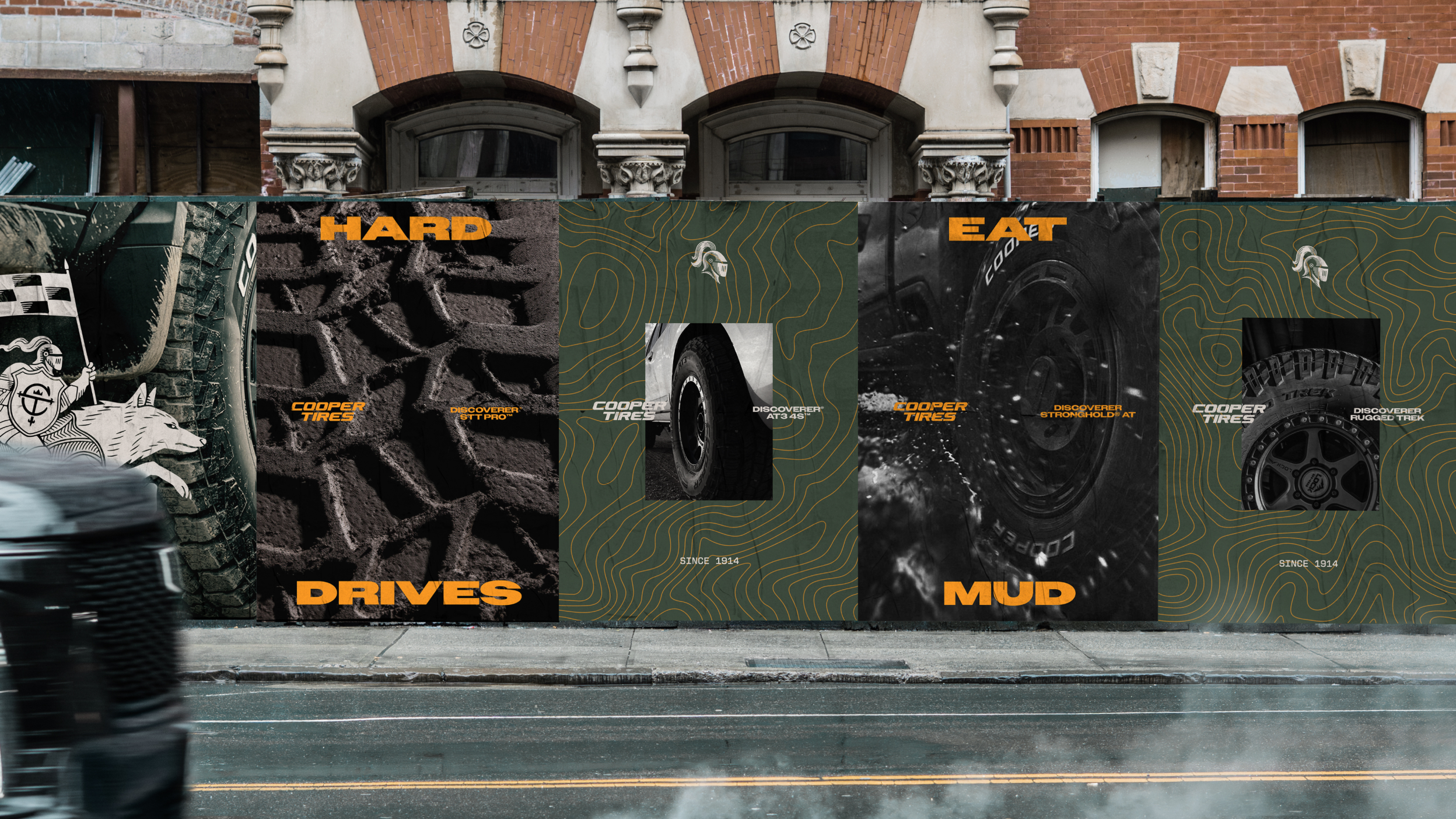
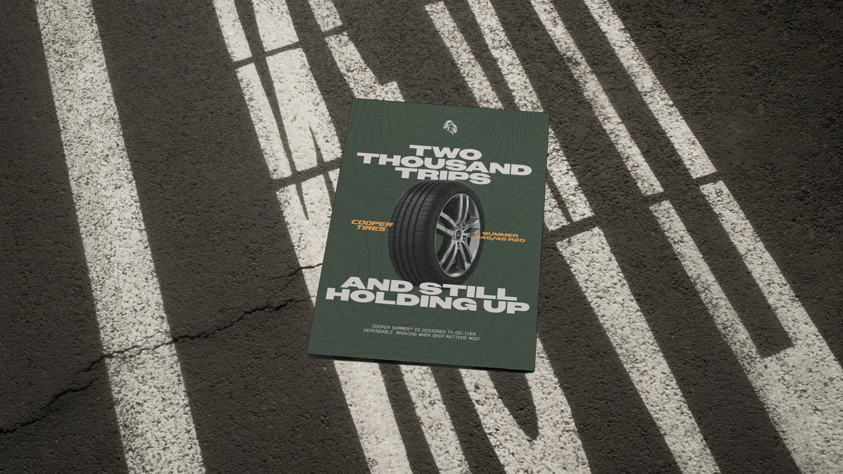
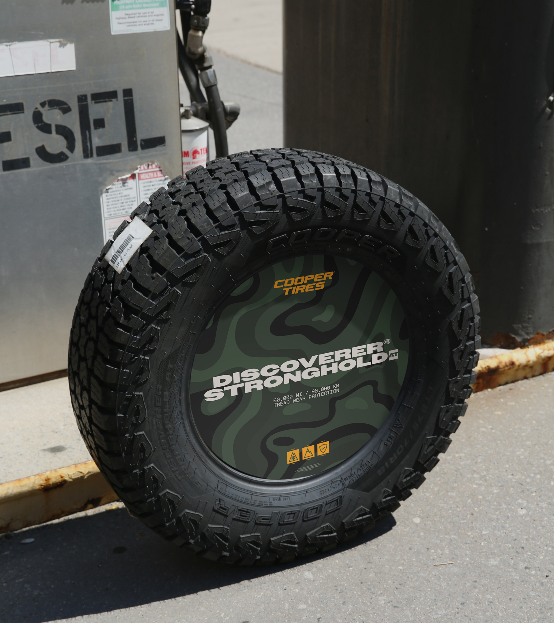
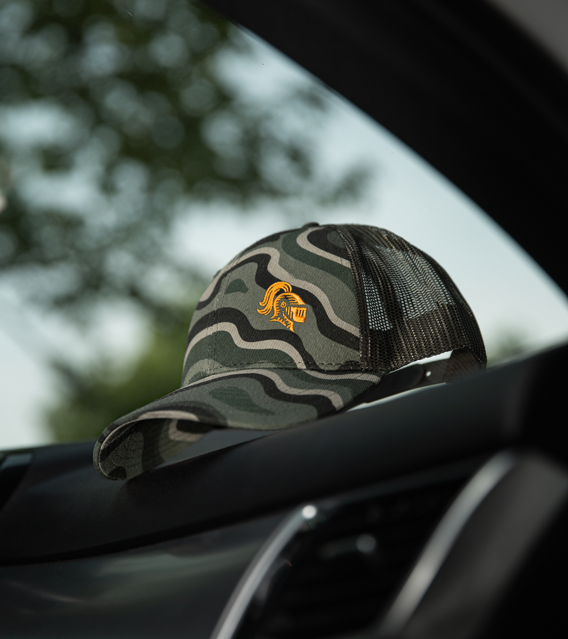
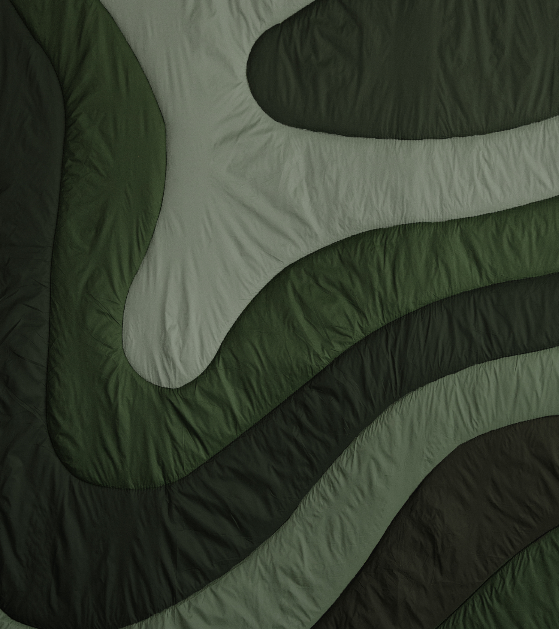
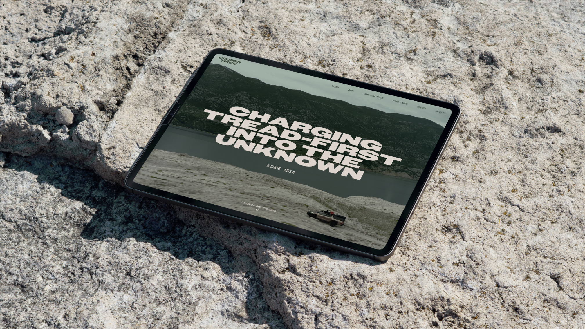
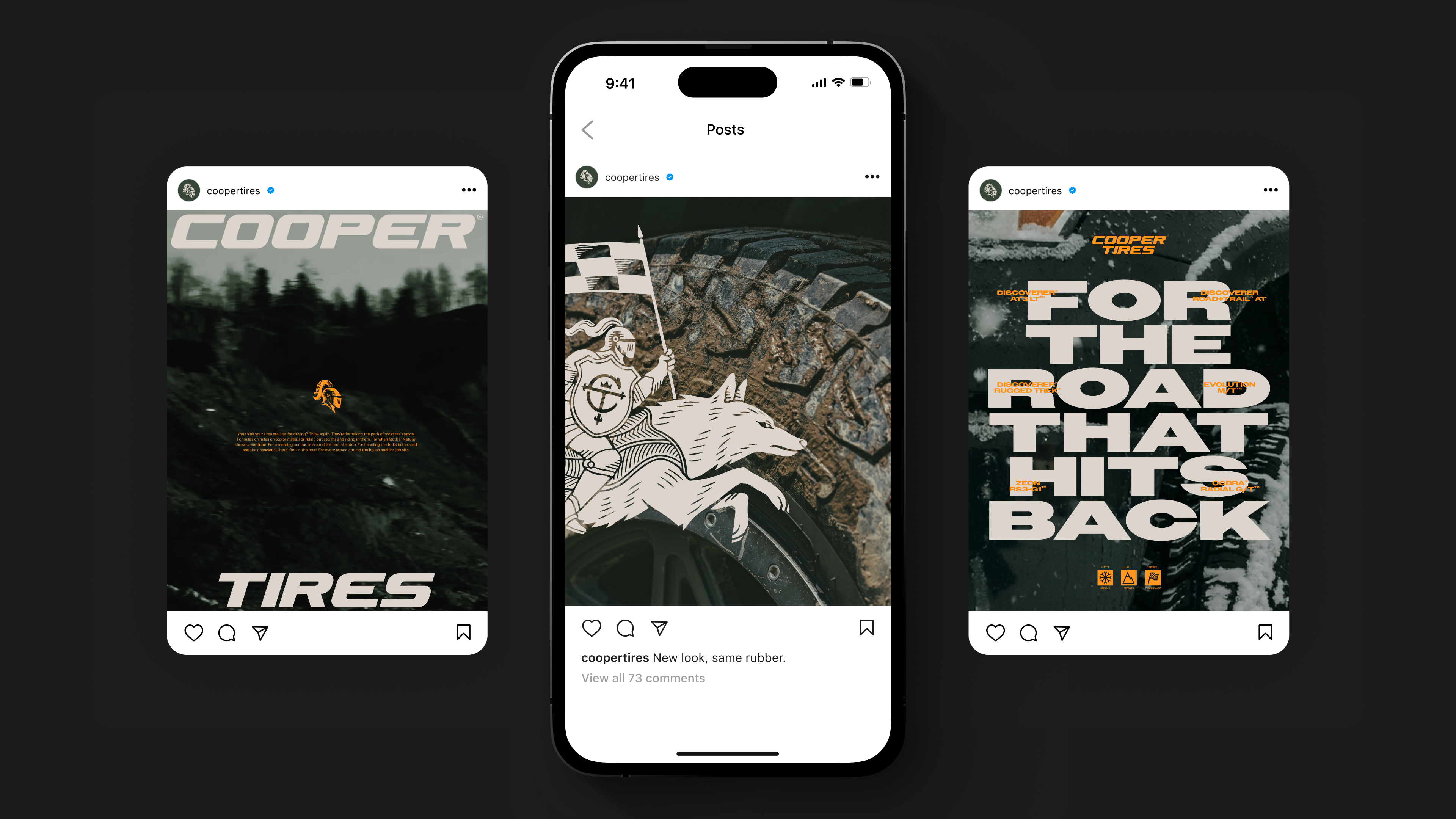
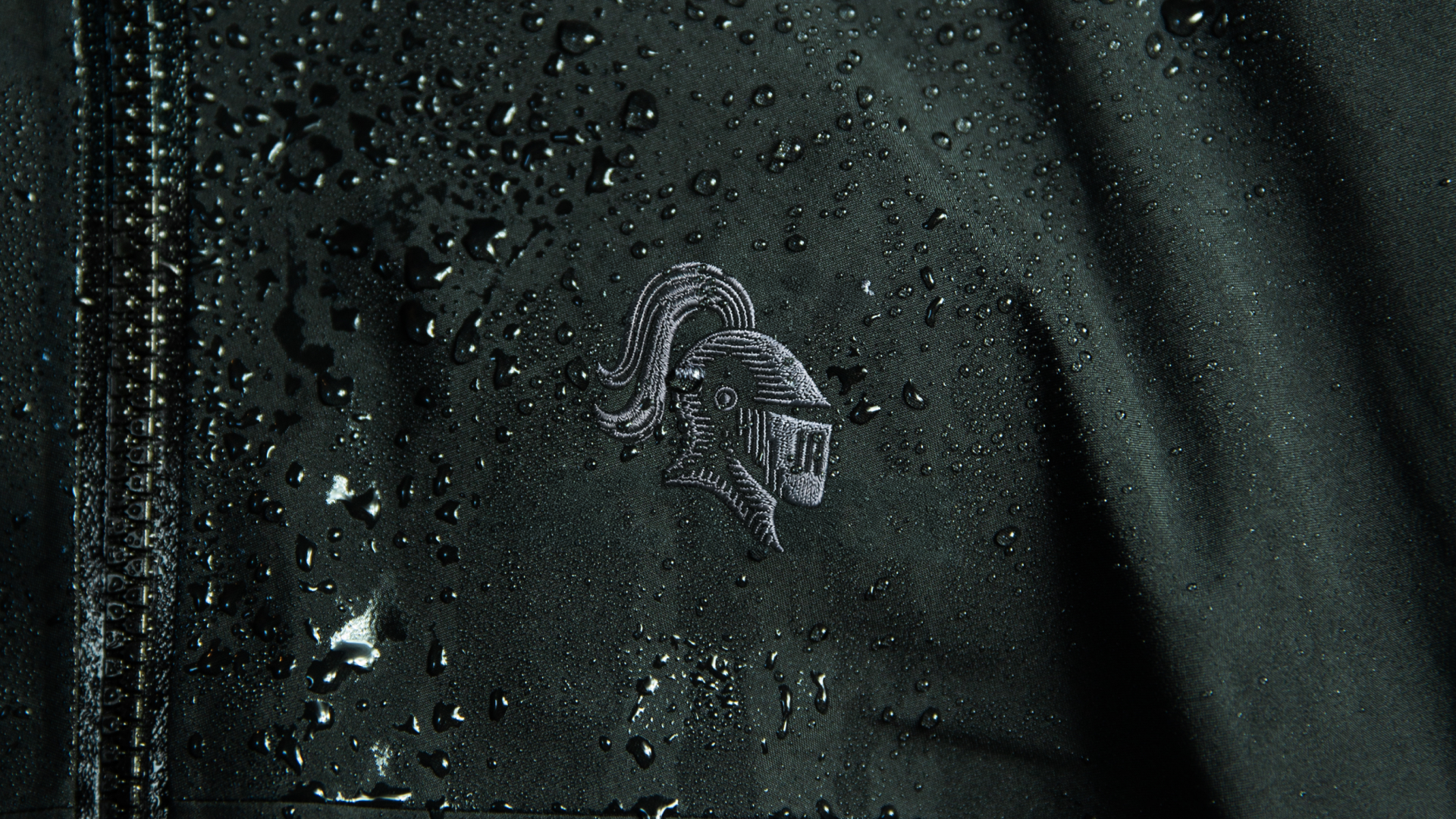
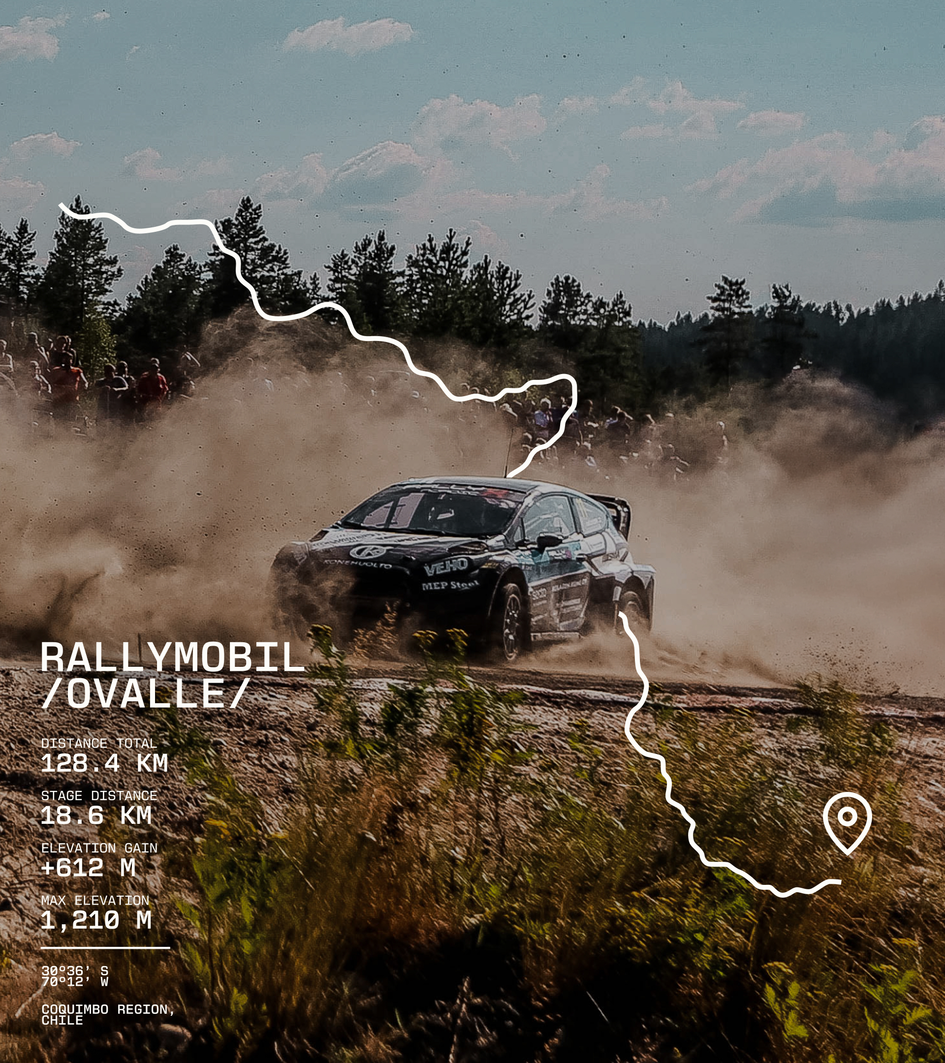
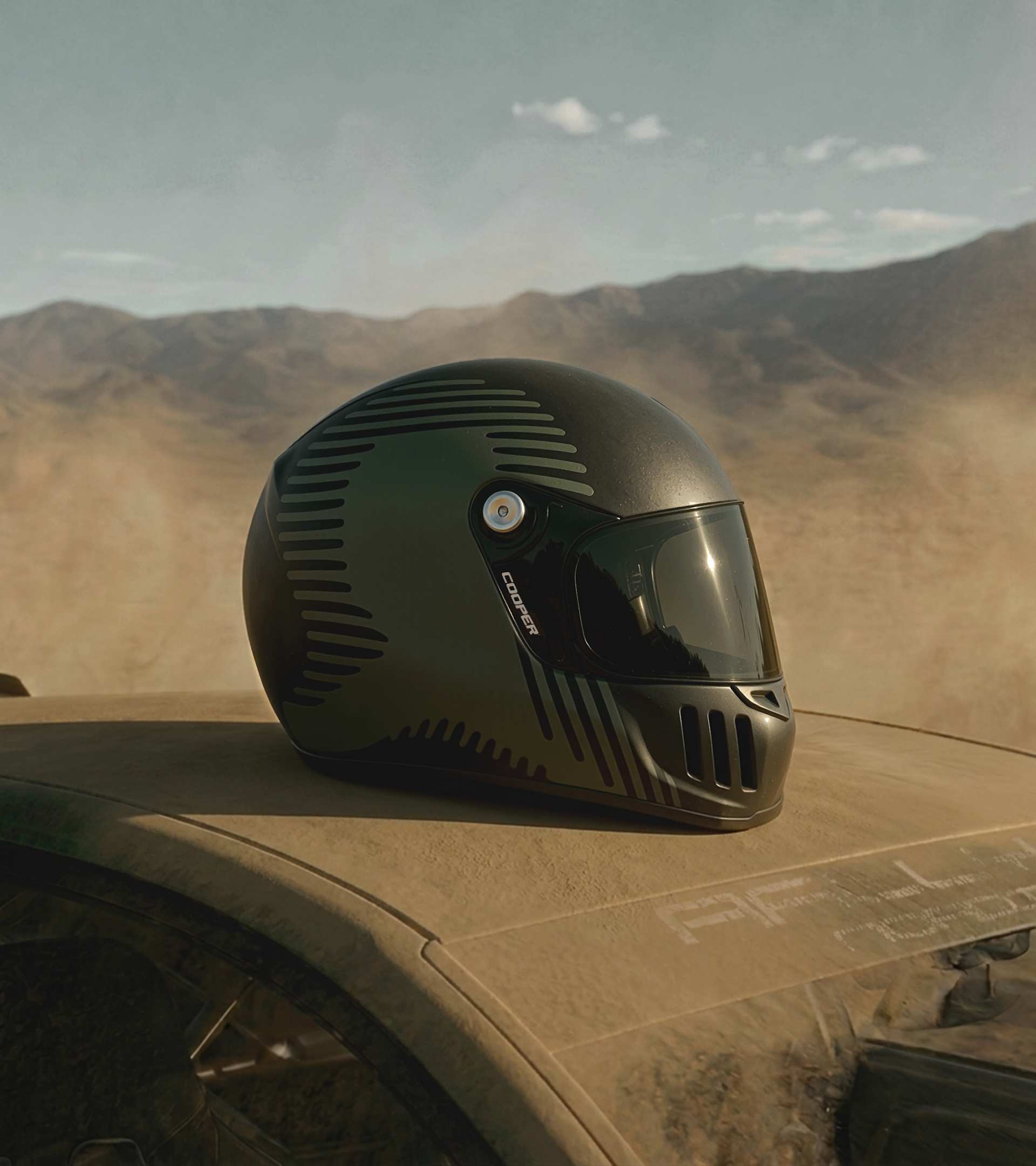
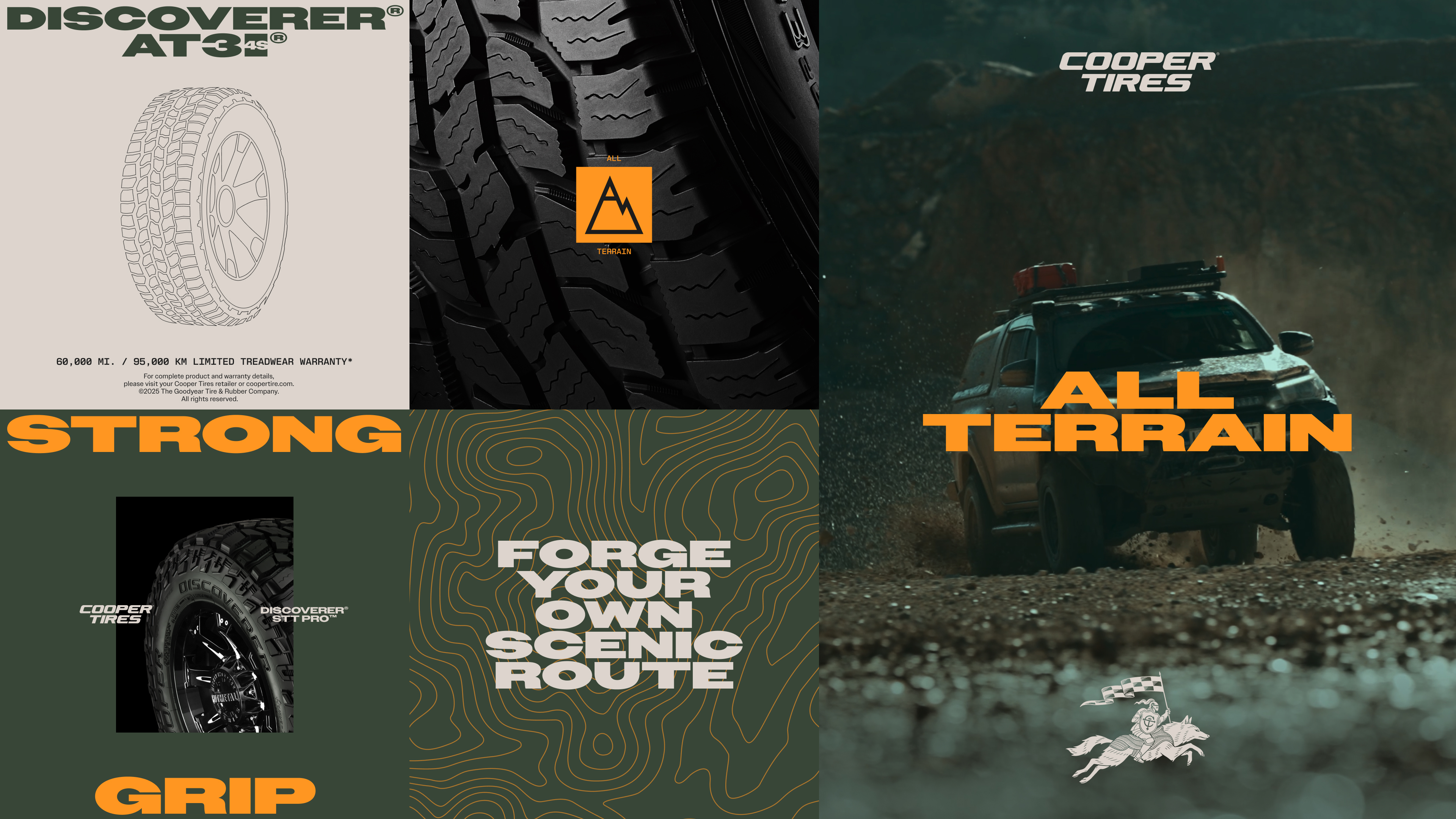
Our solution nods the rich history of the brand while taking inspiration from the product itself. The wordmark and icon take structure and inspiration from the geometry of the tread. A technical typeface draws on the engineering detail of the tires themselves, paired with a bold extended headline typeface that nods to the Cooper Tires logo. A primary color that sets Cooper apart in a category of familiar tones, and points to exactly where its toughest all-terrain tires are made to go: off the road and into the wild.
A heritage brand rebuilt from its own product–and made unmistakably Cooper.
Team:
Ryan Atkinson / Joanna Durkalec / Jin Kim / Elaine Li / Adolfo Gutierrez / Felipe Pavani / Jack Graham / Greg Bruce / Felipe Pavani / Lucy Hsiung / Tomas Molla